ShopDreamUp AI ArtDreamUp


Suggested Deviants


Suggested Collections


Comments1
Join the community to add your comment. Already a deviant? Log In
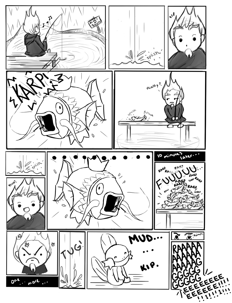
SO MANY PANELS. Okay, you always offer criticism for me so I'll do some for you guys.
1. 16 panels. Dear god. As a sequential major I think you guys can trust me here, 5-7 is where it's at. 9 panels at most, satisfying a 9-panel-grid format. A lot of these can be combined as well.
2. Gutters. Your panel gutters, the space between them, should all be the same size. But that's minor.
3. Be wary of the layout. At all costs avoid the "stack on the left" situation. For example, on the third tier. I went from the "splish" panel straight to Magikarp, and the large dots don't help. This is especially true, however, for the bottom tier. We see the character rage, then the word "TUG!" takes our attention, then maybe we get him thinking "One... more..." That, too, could be a single panel rather than making it split.
4. These all seem to be medium shots, with the occasional close-up which makes it really stale to read. Try pulling out, get some real feel for the atmosphere. You guys drew the background once and then never again, and while some *lazy* comic artists do this, it's... blah. I don't like that. Keep in mind the audience! Some people don't care about their audience, but if you're doing this for enjoyment you certainly should! It can be awesome and popular and make you guys money somehow!
5. Avoid the close-up eye shot. Just avoid it. Terrible cliché. x.x
6. There's no payoff panel. Even in webcomics there's a payoff, and I don't want to believe it's the "RAAAAAAAAAAGE" panel. That feels like a cop-out. The Magikarps take up a lot of real estate, even when you've already established a Magikarp close-up. It looks like it was copied and pasted when you could've used the space better.
7. "When in doubt, black it out." That is one of the greatest things I've learned from inking. Greys kind of lessen the impact of a layout. If the fire-haired guy's robe was a spot black and the details, if at all needed, were hinted at by highlights... that'd work much better and make the comic more dynamic. Just enough that it needs to be.
Aside from that, his robe is the only grey and it really doesn't seem significant to be a grey. Black is just stronger and with comics you want to have the strongest compositions and layouts as you can. That said...
8. Think about your panel layout as if it's a composition of its own. The panels should hold together and not just read as single objects.
As far as the humor goes... it seems very meme and and inside-joke based. I dunno, I kinda feel like we can replace the fire hair guy with anyone in our friend circle and it would still be the same comic, haha.